抱歉!
我酱久没upload新文章。。。
那是因为我上载不到图片。。。
所以我就没办法更新。。。
敬请大家原谅^^
大家还记得我上一篇的applied design吗?
现在我写的是跟applied design同样时间的final artwork。。。
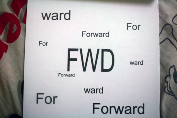
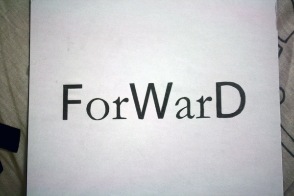
先说typograhy吧~
这个assignment是选一种font
然后在选你喜欢的字母
我叫harryyeok
我当然是选H啦~
hehe
重点是!
这些都是用手做的噢!
不是用print的!
这张是拿original scan出啦的~
接下来的是用typograhy来玩感觉
这是Part A
这是Part B
接下来是
做一个名人的印象和贡献
我选择做萧邦
这是萧邦印象
我的concept是一封信
我觉得这样可以做出萧邦的高贵,优雅和他的气质
*本人觉得罢了~
萧邦的贡献
我做成一个很抽象的钢琴
不懂你们看到出吗。。。
呵呵。。。
比较厚的字是黑键
比较细的字是白键
选用这字体是因为
这字体蛮像音符的
字体的空间是带代表它的节奏有快有慢
然后红色的字是顺下去读是chopin
chopin是萧邦的名
我用红色来把萧邦的名字弄出来
是因为萧邦对音乐热情
红色是代表热情
*如果我讲错的话,请原谅^^
最后presentation
14个星期就做了这些
extra week我们还有上typograhy
但是
是叫typograhy workshop
typograhy workshop的final是做一本书
那本书交了
我没拍到
所以没放出来咯~
抱歉^^
typograhy的课就酱完了~
真快~
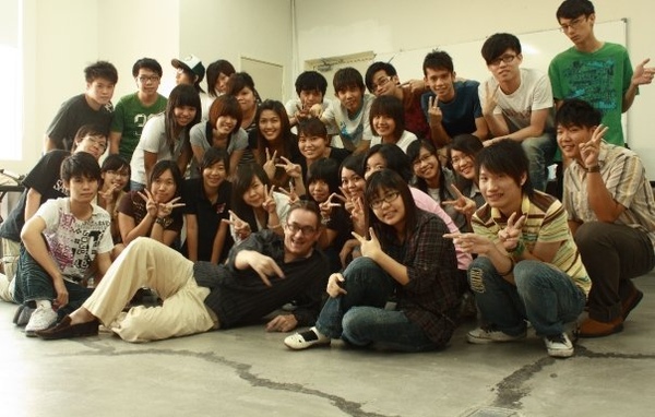
当然我们是少不了合照啦~
对了!
忘了跟你们说我的老师是荷兰人噢~
hehe
二话不说!
看照片吧~
正常的
疯狂的
XP
我的老师是不是很可爱!
hehe
我的老师叫Mr Ton
我的typograhy很烂啊!!!
接下来的是要介绍算是最辛苦的功课了
这科目是histroy of graphic design
是校长交
校长的称呼是Mr su
他的assignment是3张poster design
是一个concept
用3种不同的style
总共有20个art movement style选
我这学期的题目是
exhibition poster design
展览海报设计
因为我很喜欢摇滚
所以我选择摇滚乐当我的concept
第一张我选的style是Plakatstil
Plakatstil的特点是简单,有focus point,颜色是一片一片的
我现在就给你们看第一张的完成品
颜料是用poster color
这是poster的解释
不好意思啊!
英文很烂!
This exhibition is about rock music. I choose this rock music because I like rock music and want to let everybody knows about it also. The art movement that I choose is Plakatstil because I like about the style of Plakatstil. It is simple and not to fancy yet it can bring out the information from the poster. I choose a person holding a electric guitar is because it is a focus point and the headphone on the person symbolize rock. The black line in the background represents music equalizer and the flow of music. I choose blue color as a background because it can create a contrast with the white color of the person’s shirt. The blue color is cold color, I use blue color because black color is very strong. The electric guitar also I have chosen white color as to create a contrast with the background and also the person’s shirt. The people also have a tone as to create the feeling of Plakatstil in the poster. I choose the font face stencil because stencil font got some rock feel. The text I also choose white color because can create a contrast with the background. The headphone also do some tone to create the feeling Plakatstil in the poster. I write the word ROCK U because the feeling of rock music. The pants I also use black color because black color is rock feeling. The whole poster is bringing the message to audiences to more about rock music the color of it and the style of clothes. The spirit of rock are presented in the poster to let people know rock music are doing things with own opinion to letting others to control your life and music.
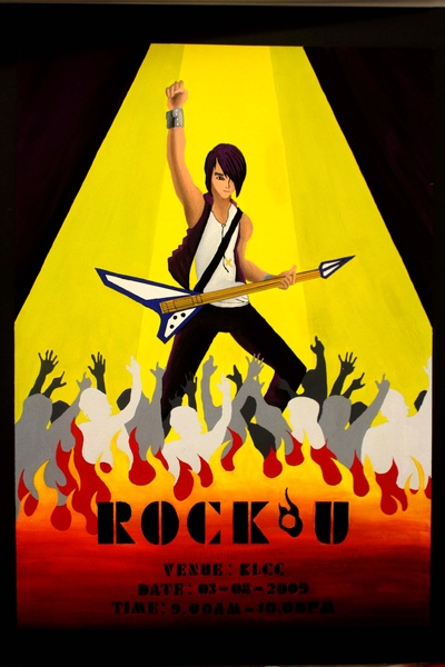
第2张我选的style是Art Deco
Art Deco是玩gradient
第2张完成品
颜料是poster color
poster的解释
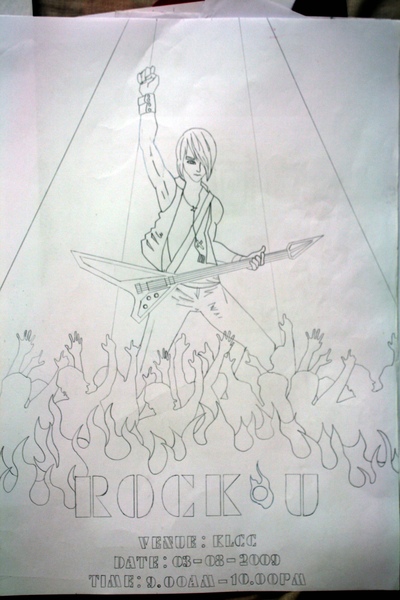
This exhibition is about rock music. I choose this rock music because I like rock music and want to let everybody knows about it also. The whole poster is bringing the message to audiences to more about rock music the color of it and the style of clothes. The spirit of rock are presented in the poster to let people know rock music are doing things with own opinion to letting others to control your life and music. The art movement that I choose is Art Deco because I like about the style of Art Deco. It is simple and not to fancy yet it can bring out the information from the poster. I choose a person holding a electric guitar is because it is a focus point and the person symbolize rock. The fire can to bring the exhibition very hot and rock. They people I put many can see like many people likes rock and see like they very high. The spot light so can bring out the person holding a electric guitar. I choose yellow color as a background because it can create a contrast with the person holding a electric guitar . The background I have chosen yellow color is warm color,so the electric guitar I use blue color because blue color is cold. The electric guitar also I have chosen sliver color as to create a contrast with the electric guitar and also the person’s pants. The people also have a gradient as to create the feeling of Art Deco in the poster. The fire I also use gradient to bringing the fire very hot and to create the feeling Art Deco in the poster. The font face Futura Black because got some rock feel. The text I also choose black color because can create a contrast with the fire. They people also do some tone to create the feeling like have many people some on top some at back. I write the word ROCK U because the feeling of rock music. The pants I also use black color and purple color to create gradient , because black color and purple color is rock feeling. The background and the person holding a electric guitar pants and coat ,I use the complementary color yellow and purple.
第3张我选New York School
我选New York School是想尝试玩college
college就是剪贴
第3张的完成品
材料绳子,纸,poster color,一种海绵的纸,铝片
poster的解释
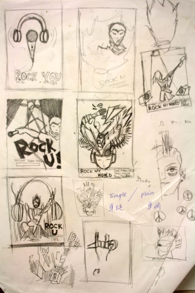
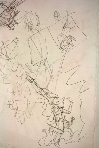
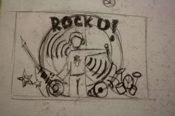
This exhibition is about rock music. I choose this rock music because I like rock music and want to let everybody knows about it also. The whole poster is bringing the message to audiences to more about rock music the color of it and the style of clothes. The spirit of rock are presented in the poster to let people know rock music are doing things with own opinion to letting others to control your life and music. The art movement that I choose is New York School because I like about the style of New York School ,playful, depends on audience and I wan try to do collage. It is playful, depends on audience to bring out the information from the poster. I choose a person holding a microphone is because it is a focus point and the person symbolize rock. I also put the wire in sliver because see like shining. The fire can to bring the exhibition very hot and rock. The spot light so can bring out the person holding a microphone. I choose purple color as a background because it can create a complementary color and contrast with the person holding a microphone. The electric guitar also I have use the tin paper as to create a contrast with the electric guitar. The fire I also use 3 color like gradient to bringing the fire very hot in the poster. The text I also choose black color because can create a contrast with the fire. I write the word ROCK U because the feeling of rock music. The person holding microphone use black color to create contrast , because black color with purple color background is rock feeling. I also try use different material to do this poster. This I got put drum and electronic organ can feeling of rock music. 我的design过程是要 经过很多过程的 一开始是 》想concept给老师prove 》sketch 》sketch improve 》进A3layout 》color sketch 》最后才完成 现在我就给你们看看过程 我只找到一些 hehe 其他的不懂在哪里了。。。
最失望的是第3张。。。
第3张真的不够时间做。。。
haiz~
接下啦是电脑课的功课
电脑课的功课是3张post card,post card cover和一件t-shirt design
post card 的concept是自己的童年到中年
第一张

这张post card是讲我童年
因为我爸爸妈妈在我5岁时就离婚了
所以我没爸爸妈妈的保护
天空我弄成阴天是因为代表我那时的心情
然后一个小朵的花就是我
就好像被人遗弃了
没人保护我
然后就羡慕其他人
其它的花都有花盆和雨伞
花盆是代表妈妈
雨伞是代表爸爸
这张是做我现在的年龄
因为我很喜欢音乐
老师也规定要画自己的脸
这张是做中年
也很喜欢背包旅行
但也要等到有稳定的经济
所以到到了中年希望可以常常的
去背包旅行!
这是post card cover design也是t-shirt的design
老师也规定我们要用自己的脸来做
但要把五官拿走
然后放一些自己的特征
我放38是因为我很38!
哈哈!
是我的朋友都知道我非常的38!
哈哈!
嘴巴我换成耳机是因为我很喜欢听歌
又爱唱K!
哈哈!
然后那些一打一打的点
就像是涂鸦的感觉
因为我也喜欢涂鸦^^
第2个学期功课终于介绍完啦!
真的很抱歉!!!
我懂我upload很忙。。。
但是
是真的!
网速太慢了。。。
anywhere~
谢谢你们来捧场^^
来了就给我一点意见吧~
谢谢^^

















 留言列表
留言列表
